From the dining table to the home office, the colors on your walls and furniture influence appetite, productivity, and even mood. Designers reveal how to use color psychology to transform spaces.

Interior design has always been about more than just aesthetics. Beyond the furniture, layout, or accessories, there’s one subtle yet powerful element that silently controls the feel of every room: color. Architects and psychologists alike agree that color choices directly affect human emotions, energy levels, and behavior. A recent design guide on “Colour Psychology in Rooms” provides clear visual examples of how to harness this influence in two of the most important areas of the modern home: the dining room and the office.
What may look like a simple shade of red or blue actually goes deeper—it can spark hunger, encourage conversation, or boost productivity. Let’s explore how color psychology transforms everyday spaces and why it matters in today’s homes.
1. The Science of Color in Daily Life
Colors are more than pigments—they’re psychological triggers. Warm tones like reds, oranges, and peaches stimulate energy and appetite, while cooler shades like blues and greys promote calmness and focus.
Warm colours activate the senses, making spaces feel cozy and lively.
Cool colours soothe the mind, encouraging relaxation or concentration.
By understanding this, homeowners can design rooms that serve their purpose better—whether it’s encouraging family bonding in the dining room or helping someone stay sharp in a home office.
2. The Dining Room: A Place for Connection and Appetite
Dining rooms are the heart of family gatherings. The colours used here have a direct influence on how people feel while eating and interacting.
Warm tones for appetite
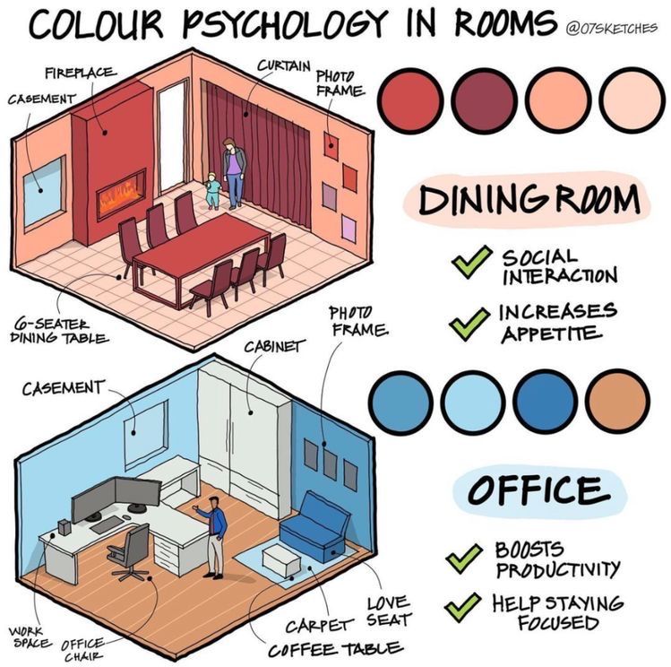
The design suggests using a palette of deep reds, burgundies, and peach shades in the dining area. These colours are scientifically linked to stimulating hunger. That’s why many restaurants also favor red or orange themes.
Boosting social interaction
The warmth of red also encourages conversation. Picture a six-seater dining table surrounded by deep red walls, warm curtains, and soft lighting. It doesn’t just look stylish—it creates a space where people feel more comfortable engaging with each other.
Practical design touches
The illustrated dining room highlights thoughtful details:
A fireplace adds literal and visual warmth.
Curtains and photo frames in warm tones complement the wall colours.
The casement windows balance brightness, ensuring the room doesn’t feel heavy.
This approach turns an ordinary dining space into a social hub, where meals are more enjoyable and family bonds are reinforced.
3. The Office: Productivity Through Cool Tones
With remote work becoming the new normal, home offices demand more attention than ever. The psychology of colour plays a vital role in designing an office that fuels efficiency.
Blues for focus and productivity
The office design opts for a palette of soft to deep blues, accented with neutral tones like beige or wood brown. Psychologists note that blue is associated with clarity of thought, productivity, and calm concentration. Unlike the dining room, where energy is key, an office needs stability and focus.
Key features of the office design
The blueprint of the office includes:
Workspace with dual monitors for efficiency.
Ergonomic office chair to support long hours of work.
Cabinets and shelves in lighter shades to reduce clutter stress.
Carpet and love seat to soften the space and allow for occasional breaks. The use of blue tones ensures workers feel less distracted and more engaged in their tasks. By reducing stress and mental fatigue, these shades help sustain productivity over time.
4. Colour as a Lifestyle Tool
The brilliance of colour psychology lies in its versatility. It doesn’t require expensive renovations—small adjustments like repainting walls, changing curtains, or switching furniture upholstery can drastically alter a room’s mood.
For instance:
Swapping out neutral dining chairs for burgundy ones instantly makes meals more inviting.
Adding a light blue rug to a home office subtly enhances focus.
Incorporating art or photo frames in strategic shades ties the room’s palette together.
Colour choices, therefore, become a lifestyle tool, shaping how people interact with their environment daily.
5. Why This Matters More Than Ever
In the post-pandemic era, homes have transformed into multi-functional spaces—serving as offices, classrooms, restaurants, and relaxation zones. As such, thoughtful design is no longer a luxury but a necessity.
Dining rooms have regained importance as families dine together more often.
Home offices have become crucial for work-life balance.
By leveraging colour psychology, homeowners can ensure their spaces support well-being and functionality, not just aesthetics.
6. Expert Insights and Real-World Applications
Interior designers increasingly adopt psychology-backed approaches to colour selection. A designer might recommend:
Red accent walls in restaurants and cafes to drive appetite.
Blue classrooms or libraries to encourage learning and retention.
Soft earthy tones in bedrooms to promote restfulness.
These principles are not confined to homes; they are visible in corporate offices, educational institutions, and healthcare spaces, where the environment directly influences behavior.
7. Achieving Balance: The Role of Contrast
While colour psychology highlights the strengths of certain shades, balance is critical. Too much red in a dining room may feel overwhelming, while excessive blue in an office could feel cold or isolating.
The designs cleverly balance colours with neutral elements like cabinets, flooring, and furniture. By mixing warm and cool tones in moderation, rooms achieve harmony without overstimulation.
Conclusion: Colours That Shape Everyday Life
The front-view illustration of colour psychology in rooms makes one thing clear: colours are silent influencers of our daily lives. The right shades can transform a meal into a joyful gathering or a workday into a productive flow.
Dining rooms thrive on reds and peaches, boosting appetite and social warmth.
Offices excel with blues and cool tones, driving focus and calm efficiency.
As homeowners rethink their spaces, colour becomes a powerful, affordable, and creative design tool. By simply understanding and applying colour psychology, anyone can craft environments that not only look beautiful but also feel right for their intended purpose.
This is not just about walls or furniture—it’s about living better through design.