August 10, 2025 – A two-bedroom, two-bathroom house plan making the rounds online presents a clear, straightforward layout that seems practical on its face. With a large living room, a dedicated dining area, and good separation between the bedrooms, it follows a design logic that was once the standard for American homes.
However, a closer analysis reveals that this floor plan is a relic of a bygone era in home design. Its biggest features—the very separation of its rooms—are now considered significant functional flaws. This plan serves as a fascinating case study in how American lifestyles have evolved and why the modern open-concept layout has become king, highlighting a critical mistake in its circulation that would frustrate any contemporary family.
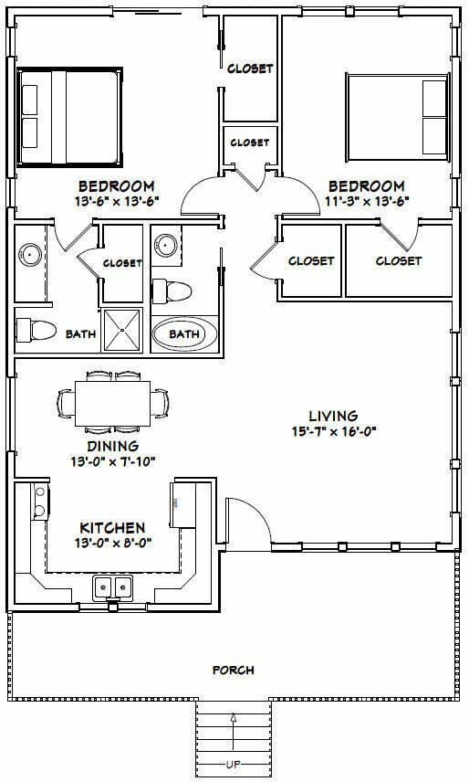
Step 1: An Anatomy of a Compartmentalized Home
Before dissecting its flaws, it’s helpful to understand the plan’s components as they were likely intended. The design philosophy is one of compartmentalization, where every room has a distinct, separate function.
- The Bedroom Wing: The plan features a “split-bedroom” layout, with bedrooms on opposite sides of the house. The bedroom on the left serves as the primary suite with its own private bathroom. The bedroom on the right has access to two closets and uses the hall bathroom.
- The Utility Zone: A U-shaped kitchen is positioned next to a formal dining space. A closet in the central hallway appears designated for a washer and dryer.
- The Public Space: A large, 15’x16′ living room is set apart as the home’s main area for relaxation and entertaining guests.
- The Entry: A covered front porch provides a welcoming entry point into the home.
On paper, the plan provides all the necessary spaces for a small family or couple in a seemingly organized way.
Step 2: The Critical Mistake – The Kitchen as a Main Corridor
The most significant and immediate functional flaw in this design is its circulation path, or “flow.”
- The Problem: To get from the bedrooms to the home’s primary living space, the living room, a person has no choice but to walk directly through the middle of the kitchen. The path cuts right through the center of the U-shaped workspace, turning the kitchen into the main thoroughfare for the entire house.
- The Real-World Consequences: Imagine trying to prepare a meal. Family members walking from their bedrooms to the living room would constantly be passing through your work area. This is not only highly inefficient for the cook but also disruptive for everyone else. It violates the most basic principle of kitchen design, which calls for protecting the “work triangle” (the path between the sink, stove, and refrigerator) from through-traffic. This design puts a highway right through the middle of it.
The Correction: A modern designer would immediately seek to reroute this traffic. The most obvious solution would be to remove the wall between the dining and living rooms, creating one large “great room.” This would allow for a more direct path between the bedrooms and living area along the home’s back wall, leaving the kitchen workspace protected and unobstructed.
[Image showing a floor plan with red dotted lines indicating a disruptive traffic flow through a U-shaped kitchen]
Step 3: The Second Flaw – The Isolated Living Room
The second major issue is a direct result of the compartmentalized design philosophy and speaks to a fundamental shift in American family life.
- The Problem: The large living room is completely separated from the kitchen and dining area by a full wall. While this creates a formal, quiet space, it is socially isolating.
- The Social Consequences: In a modern home, the kitchen is the hub of family activity. This layout prevents a parent from keeping an eye on children playing in the living room while they prepare dinner. It isolates the host from guests during a party. The home feels broken into separate zones rather than being a single, connected family space. This sense of disconnection is precisely what the modern open-concept design seeks to eliminate.
Step 4: An Expert’s View on a Bygone Era
“This floor plan is a perfect snapshot of mid-to-late 20th-century residential design,” says David Chen, a (fictional) real estate analyst who tracks housing trends. “Back then, the kitchen was seen as a purely utilitarian workspace, almost like a laboratory, and it was hidden away. The living room was a formal space for receiving guests. That’s just not how we live anymore.”
“Today’s buyers want connection and multitasking,” Chen continues. “They want to be cooking, helping with homework, and chatting with their partner all in one bright, open space. If a client were considering buying a house with this layout today, the first conversation would be about the cost and feasibility of taking out the wall between the living room and dining room. It’s a layout that practically begs to be renovated.”
Conclusion: A Lesson in Lifestyle and Flow
This floor plan is an excellent educational tool, not for its utility today, but as a historical document that shows how much our expectations for a home have changed. It demonstrates that the most important features of a house are not just the rooms themselves, but the invisible paths of movement and sightlines between them.
For anyone looking to buy, build, or renovate, this plan offers a clear lesson: pay attention to the flow. A layout that separates and isolates may look organized on paper, but a home that connects and flows is one that will better serve the dynamic needs of a modern family.