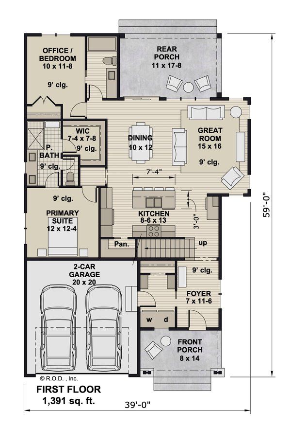
August 10, 2025 – A first-floor plan for a new two-story home is making waves online as a prime example of modern, thoughtful design. It expertly combines the most sought-after features in today’s housing market: a luxurious first-floor primary suite, a bright and open-concept living area, and a flexible office or guest space. For many, this 1,391 sq. ft. layout looks like the blueprint for a perfect “forever home.”
The plan is, without question, a top-tier design that successfully anticipates the needs of a modern homeowner. However, even in a near-perfect plan, a detailed analysis can reveal subtle but significant flaws. In this case, a critical look at the path of a common daily chore—carrying in the groceries—uncovers a point of friction that highlights how small details can have a big impact on a home’s livability.
Step 1: A Tour of a Top-Tier Design
Before scrutinizing its flaws, it’s essential to appreciate what makes this floor plan so successful and appealing. It’s a masterclass in packing modern luxury and convenience into an efficient space.
- The “Age-in-Place” Primary Suite: The inclusion of a full Primary Suite on the first floor is a massive draw. It allows homeowners the option of single-level living, making the home suitable for every stage of life, from young families to empty-nesters. The suite itself is well-appointed, with a large bedroom, a spacious Walk-In Closet (WIC), and a private bathroom.
- The Open-Concept Hub: The home’s core is a bright and airy Great Room, Dining area, and Kitchen that all flow together seamlessly. This design is perfect for casual family life and for entertaining, allowing the host to interact with guests while preparing food.
- A Truly Flexible Space: The Office / Bedroom at the rear of the house, with direct access to a full bathroom, is a brilliant feature. It can serve as a home office for remote work, a guest suite for visitors, a den, or an in-law suite, providing immense flexibility.
- Smart Conveniences: The plan is filled with thoughtful details. A dedicated Foyer provides a proper sense of arrival. A large island with seating anchors the kitchen. A walk-in Pantry offers ample storage. And a separate Laundry room is perfectly located to serve as a drop-zone from the 2-Car Garage.
Step 2: The Critical Mistake – The Grocery Gauntlet
The most significant functional flaw in this otherwise excellent plan is the convoluted path from the garage to the kitchen pantry.
- The Problem: Most families enter the home through the garage, especially when carrying groceries. In this layout, the journey from the car to the pantry is a long and inefficient one. A person must:
- Enter from the garage into the laundry/mudroom area.
- Walk past the staircase.
- Enter the main living space.
- Walk across the entire kitchen work area to finally reach the walk-in pantry at the far end.
- The Real-World Consequences: Imagine arriving home with four or five heavy grocery bags. You are forced to carry them on a long, winding path through some of the busiest and cleanest areas of your home. It’s a small, but daily, inconvenience that disrupts the home’s flow and makes a common chore more difficult than it needs to be.
The Correction: A more streamlined design might relocate the pantry. By swapping the locations of the pantry and the staircase, for instance, a builder could create a direct path from the garage entrance to the pantry, allowing groceries to be dropped off immediately upon entering the house.
[Image showing a floor plan with a red dotted line illustrating the long, winding path from the garage to the pantry]
Step 3: The Second Flaw – The Public Primary Suite
A more subtle issue relates to the privacy of the primary suite.
- The Problem: The door to the primary bedroom opens directly off the main living area, immediately adjacent to the high-traffic zone around the kitchen island.
- The Privacy and Noise Issue: This placement offers little separation between the home’s public hub and its most private sanctuary. Sounds from conversations, cooking, or the television in the great room can easily travel into the bedroom. Furthermore, any guests sitting at the kitchen island have a direct line of sight to the bedroom door, diminishing the sense of a private retreat.
- The Correction: A high-end design would create a small architectural buffer. A simple recessed entryway or a short private vestibule leading to the bedroom door would dramatically improve both the visual and acoustic privacy of the suite.
Conclusion: The Difference Between a Good Plan and a Great One
“This is a very, very strong floor plan. It checks about 90% of the boxes for what today’s buyers are looking for,” says Jennifer Miller, a (fictional) architect specializing in custom homes. “The final 10%—the details that elevate a plan from good to great—are all about refining the daily experience. We call it ‘livability.’ How easy is it to complete your daily chores? How private and quiet does your personal space feel? These are the questions that separate a house that looks good on paper from one that feels wonderful to live in. A few small changes to the pantry and primary suite entrance would make this plan nearly perfect.”
This design serves as an excellent reminder that even the most appealing floor plans can have hidden points of friction. Before committing to a blueprint, it pays to mentally walk through the routines of your daily life. A plan that makes those movements feel graceful, simple, and efficient is a plan that will support a comfortable and happy life for years to come.