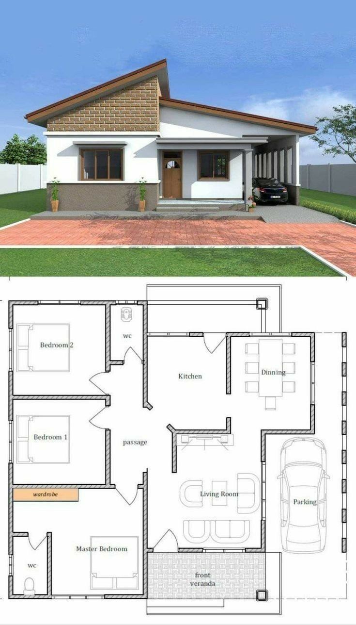
August 10, 2025 – With its sharp, contemporary roofline and clean facade, a home design circulating online presents a compelling vision of modern style. The accompanying floor plan promises a functional three-bedroom layout that appears to be a perfect fit for a young family or first-time homebuyer.
But behind the attractive rendering lies a floor plan with deep, fundamental flaws that would make everyday life a frustrating exercise in navigation. The home’s stylish exterior conceals a confusing circulation path and a shocking lack of basic amenities, serving as a powerful reminder that curb appeal can’t compensate for a poorly designed interior.
Step 1: The Promise of a Modern Home
The initial appeal of this design is undeniable. The 3D rendering showcases a home that breaks from traditional suburban models.
- A Dynamic Exterior: The asymmetrical, multi-pitched roofline creates a dramatic and modern silhouette. The use of mixed materials, including a stone or tile accent on the gable, adds texture and visual interest. The integrated carport is a sleek, minimalist alternative to a traditional garage.
- A Seemingly Functional Layout: The floor plan lays out three bedrooms and two bathrooms. The Master Bedroom is separated from the secondary bedrooms for privacy and includes its own en-suite bathroom and a large space for a wardrobe. The public spaces—Living Room, Dining, and Kitchen—are arranged in a logical sequence.
On the surface, it looks like a thoughtfully planned, contemporary home.
Step 2: The Critical Mistake – The Kitchen as the Central Tollbooth
The first major sign of trouble is the home’s circulation, or “flow.” The layout forces all movement between the main living area and the private bedroom wing through a single, inconvenient bottleneck: the kitchen.
- The Problem: Trace the path from the Living Room to the Master Bedroom. A person must exit the living room, walk through the entire dining area, enter the enclosed kitchen, walk through the kitchen’s primary workspace, and then finally access the passage that leads to the bedrooms. The kitchen door effectively becomes a mandatory tollbooth for the entire house.
- The Real-World Consequences: This design would be maddening to live with. Every trip from the couch to a bedroom, or from a bedroom to the front door, requires a detour through the kitchen. This creates constant foot traffic through a busy work zone, disrupting anyone who is cooking. It’s an inefficient, impractical, and fundamentally flawed layout that creates unnecessary steps and daily friction for its inhabitants.
Step 3: The Second Mistake – The Case of the Missing Closets
Beyond the flawed circulation, the plan contains another glaring omission that would make it virtually unsellable on the US market.
- The Problem: While the Master Bedroom has a generous space allocated for a wardrobe,
Bedroom 1andBedroom 2have no closets at all. There is no built-in space designated for storing clothes in either of the secondary bedrooms. - The Market Consequences: In the United States, a room is generally not considered a legal, conforming bedroom unless it has a closet. This isn’t just a matter of preference; it affects a home’s appraisal, its marketability, and its fundamental functionality. A family moving into this home would have to rely on bulky freestanding wardrobes, which eat into the already modest room space, or undertake an immediate and costly renovation to build closets. This is a deal-breaking flaw for almost any American buyer.
- Other Missing Amenities: The plan also lacks any designated space for a washer and dryer, an HVAC air handler, or a water heater, all of which are standard requirements for new construction.
[Image showing a bedroom with a well-organized built-in closet]
Step 4: An Expert’s View on Looks vs. Livability
“This is a design that clearly prioritized the exterior rendering over the interior floor plan,” says David Chen, a (fictional) real estate analyst. “A buyer might see the cool, modern look from the street and be intrigued. But the moment they walk inside and try to understand how they would live in the space, the appeal would evaporate.”
“The lack of closets in two bedrooms and the bizarre requirement to walk through the kitchen to get anywhere are functional failures,” Chen continues. “A home like this would be a very difficult sell. It highlights the most important rule for potential homebuyers: don’t fall in love with the picture before you’ve scrutinized the floor plan. The way a home functions on the inside is infinitely more important than how it looks from the outside.”
Conclusion: A Home Must Work From the Inside Out
This stylish home design is a powerful case study in the difference between aesthetics and true architectural design. A beautiful facade cannot make up for a frustrating and illogical interior. The true value, comfort, and enjoyment of a home are determined by how well its layout supports the simple routines of daily life.
For anyone looking to build or buy, the lesson is clear. Look past the enticing renderings and learn to read the floor plan. Trace the paths you would walk every day. Count the closets. Imagine where the laundry will go. A home that works on the inside is a home that will bring you joy for years to come—a truth that no stylish roofline can change.