A timeless design principle shows how balancing dominant, secondary, and accent colors can transform any space into a visually stunning and harmonious environment.
When you walk into a beautifully designed room, chances are it’s not just luck—it’s the 60:30:10 color rule at work. This golden formula of interior design creates balance, harmony, and visual interest by assigning clear roles to dominant, secondary, and accent colors.
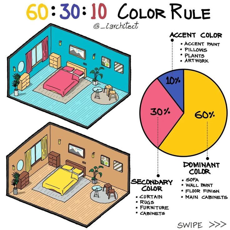
The infographic above breaks it down in a way that’s easy to see: from walls to rugs, pillows to artwork, each shade has its place in the puzzle.
🎨 What is the 60:30:10 Rule?
This rule is simple but powerful:
-
60% Dominant Color: The foundation of the room—think wall paint, flooring, and large furniture.
-
30% Secondary Color: Adds contrast and depth through curtains, rugs, smaller furniture, and cabinetry.
-
10% Accent Color: The “pop factor” that gives personality via pillows, artwork, or plants.
The result? A room that feels cohesive, balanced, and engaging without overwhelming the eye.
🏡 How It Works in Practice
1. Dominant Color (60%)
This is the backdrop that sets the mood of the room. For example:
-
A teal wall and floor finish in the top example.
-
A warm brown palette in the bottom example.
It covers the largest areas and provides stability, making the other colors stand out naturally.
2. Secondary Color (30%)
This complements the dominant color and creates harmony. Curtains, rugs, and furniture are perfect candidates for secondary tones.
-
In the teal room: earthy neutrals balance the brightness.
-
In the brown room: muted yellow adds depth without stealing the show.
3. Accent Color (10%)
Small but mighty, this is where personality shines. Accent colors highlight focal points and can change seasonally.
-
Bright pink bed linens in the first example.
-
Sunny yellow bedding in the second.
Even though they only occupy 10%, accents make the entire space come alive.
🌈 Why Designers Swear By It
-
Balance: Prevents overwhelming the senses with too much of one color.
-
Flexibility: Works across styles—from modern minimalist to cozy traditional.
-
Consistency: Ensures every element feels intentional.
-
Creativity with Control: Allows bold accents without overpowering the room.
📌 Tips for Using the 60:30:10 Rule in Your Home
-
Start with a Neutral Base: Whites, grays, or beiges are easy dominant colors to build on.
-
Use Color Psychology: Blues calm, yellows energize, reds stimulate appetite. Match the mood to the room’s purpose.
-
Accents Can Be Swapped: Change cushions, art, or throws seasonally for a fresh look without repainting.
-
Test Before You Commit: Always sample paint and fabrics in natural light before finalizing.
✨ Beyond the Rule: Creative Variations
Some designers tweak the formula:
-
70:20:10: For more subtle contrast.
-
60:20:20: To use bolder accents.
But no matter the variation, the core principle remains: proportion creates harmony.
🌟 Final Word
The 60:30:10 color rule is more than just a design hack—it’s a framework for crafting spaces that are visually balanced, emotionally resonant, and timelessly stylish. Whether you love bold shades or calming neutrals, this rule ensures your home feels like it’s been designed with intention, not chance.