August 10, 2025 – In the world of online floor plans, a sprawling four-bedroom, single-story home design presents an ambitious take on modern living. At first glance, it appears to be the ultimate “open-concept” space, with a massive, continuous room dedicated to all family and social activities.
But a deeper analysis reveals that this commitment to openness comes at a steep price. The design’s elongated, tunnel-like layout sacrifices privacy, intimacy, and practical circulation, creating a home that feels less like a cozy retreat and more like a public hall. This plan serves as a powerful cautionary tale about how the popular “open-concept” trend, when taken to an extreme, can go terribly wrong.
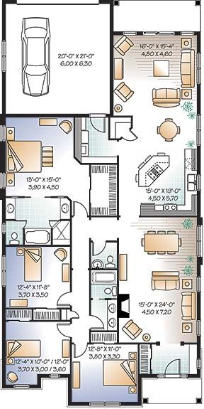
Step 1: A House of Two Halves – The Plan’s Intended Zones
The floor plan is clearly organized into two distinct, parallel wings, demonstrating a deliberate attempt to separate the home’s functions.
- The Private Wing: The entire left side of the house is a dedicated sleeping zone. It contains four bedrooms and three bathrooms. The primary suite (top left) includes an en-suite bathroom and a long walk-in closet. A second bedroom (bottom right, though located in the other wing) also has its own en-suite, making it an ideal guest suite. The two middle bedrooms share a hall bathroom.
- The Public Wing: The entire right side of the house is one enormous, open space, running the full length of the home. This “great room” is zoned into three areas: a formal living area at the top, a large kitchen with an angled island in the middle, and a second, more casual living or dining space at the bottom near the main entrance.
- Amenities: With four bedrooms and three bathrooms, the plan offers a generous amount of space for a large family or for hosting multiple guests.
Step 2: The Critical Mistake – Life in the “Endless Room”
The plan’s most significant flaw is its primary design feature: the single, massive living space.
- The Problem: The “Bowling Alley” Effect. By placing all the public functions in one long, unbroken room, the design creates a space with the acoustics and lack of intimacy of a bowling alley or a train station concourse. There are no architectural cues—like partial walls, changes in ceiling height, or built-in dividers—to define the different zones. Sound would travel unimpeded from one end to the other.
- The Real-World Consequences: Imagine the daily experience. A person trying to have a quiet conversation or read a book in the formal living area at the top would be disrupted by the sounds of cooking and conversation from the kitchen 30 feet away, and by the television playing in the family room at the far end of the house. Furnishing this space would be a nightmare, as any arrangement of sofas and chairs would feel like it’s floating awkwardly in the middle of a vast hallway. The home lacks any sense of coziness or defined purpose.
The Correction: Good open-concept design isn’t just about removing walls; it’s about creating defined “rooms within a room.” This can be achieved with large area rugs, strategic furniture grouping, decorative screens, or architectural elements like soffits and beams to create psychological divisions within the larger space.
Step 3: The Second Flaw – A Severe Lack of Privacy and Flow
The home’s circulation and the relationship between public and private spaces are deeply problematic.
- The “Living Room Bedroom”: The bedroom at the bottom right opens directly into the main living area. This offers zero privacy for its occupant. Any guest sitting on the living room sofa would have a direct line of sight into the bedroom when the door is opened.
- The Garage Entry: The door from the one-car garage opens directly into the formal sitting area. This forces a homeowner to carry groceries or enter from their car through what should be one of the most tranquil parts of the house.
- The Long Walk to Bed: To get from the main entrance to the primary bedroom suite, one must walk through the entire lower living area and the entire kitchen, a long and public journey to get to a private space.
Step 4: An Expert’s View on Open vs. Unstructured Design
“This floor plan is a classic case of taking a good idea—openness—and executing it poorly,” says Susan Lowell, a (fictional) Certified Kitchen and Bath Designer. “It’s all ‘open’ and no ‘concept.’ A family home needs a hierarchy of spaces, from very public to very private. This layout blurs those lines to the point of being dysfunctional.”
“The kitchen island is floating in the middle of a thoroughfare, the two living areas will compete with each other acoustically, and the bedroom off the main room is a privacy nightmare,” she continues. “While the house has a lot of square footage, the ‘livable’ square footage is much lower because the layout is so impractical. Good design guides you through a space intuitively; this one leaves you feeling lost in a hall.”
Conclusion: The Difference Between Open and Empty
This sprawling floor plan is a powerful illustration that bigger is not always better, and “open” is not always functional. A successful open-concept home feels connected and spacious, but it also provides defined, comfortable zones for different activities.
For anyone looking to build or buy, this plan serves as a crucial reminder to look beyond square footage and room count. A well-designed, smaller home with a smart, efficient layout that respects privacy and creates intimate spaces will always be more comfortable and valuable than a large home with a flawed, cavernous, and confusing floor plan.